An Innovative, On-demand Meeting Experience for a Singapore Based Startup
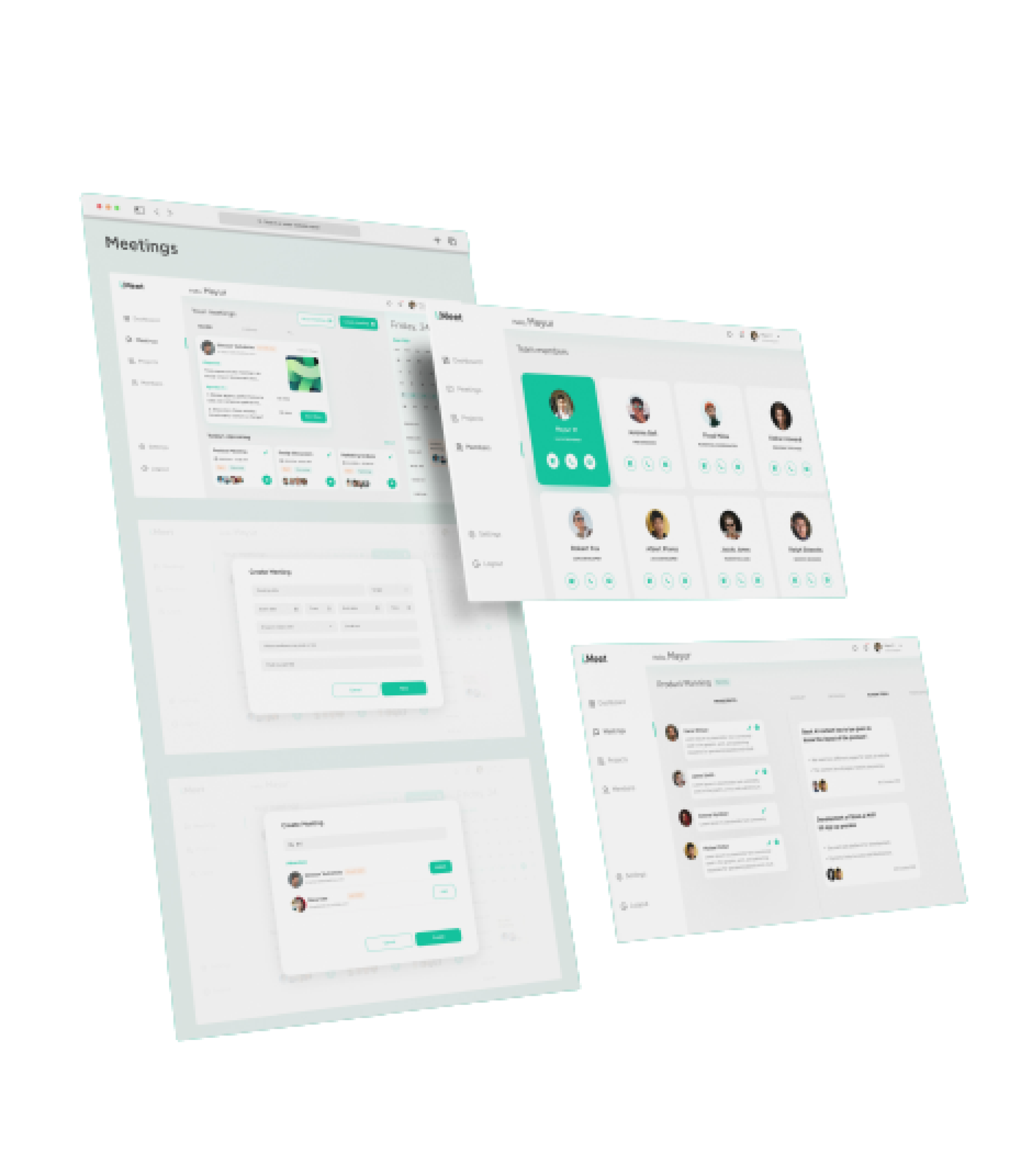
One of the biggest drawbacks of virtual meetings is the need for a lot of notes and reminders.
What if you could turn your meeting points into a script that enables attendees to do the work more effectively?
That’s what we did with IMeet, a tool that allows you to turn every meeting point into an action item on an agenda.
Objective
Meetings are important, but they can also be incredibly time-consuming. we helped in getting out of meetings in a way that doesn’t feel like a chore—because, let’s face it: meeting minutes are a pain.
We developed IMeet to offer more effective meetings where you get done with everything you need to do with less hassle and more fun!

Problems
In this case, the lack of employee engagement impacted performance and retention and the employees were not getting the kind of feedback they want or need, so they don’t feel like they can take ownership of their performance and growth goals.
Lack of collaboration across teams and within teams. Also causing confusion among their coworkers and stifling collaboration across departments (and even within departments) due to missed MoMs.
Poor onboarding communication and cross-team coordination. New attendees in the meetings were not getting the kind of help.
Challenges
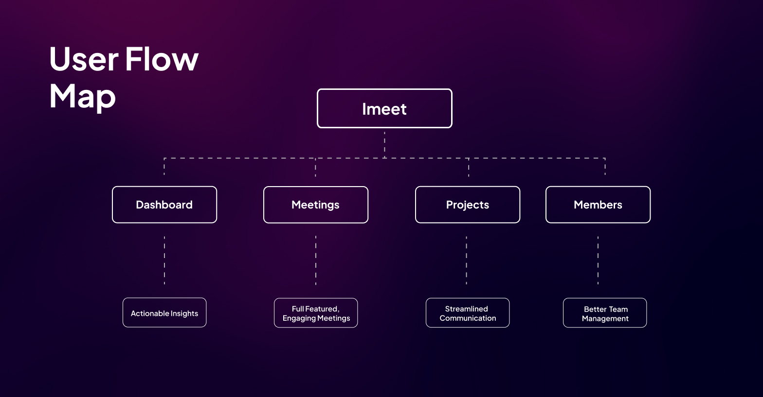
Implementing UX/UI was difficult because we were building this software for two different types of users: administrators and employees.
Admin users have varying requirements, which means that we had to implement a system that served both their needs and those of employees. We also had to make sure that the interface was intuitive enough for both groups but didn’t overwhelm or confound them.
Maintaining consistency despite the fact that each type of user has varied requirements and features was an additional challenge. The interface needed to be easy enough for all users to navigate, but not so simple as to make it redundant or uninformative.

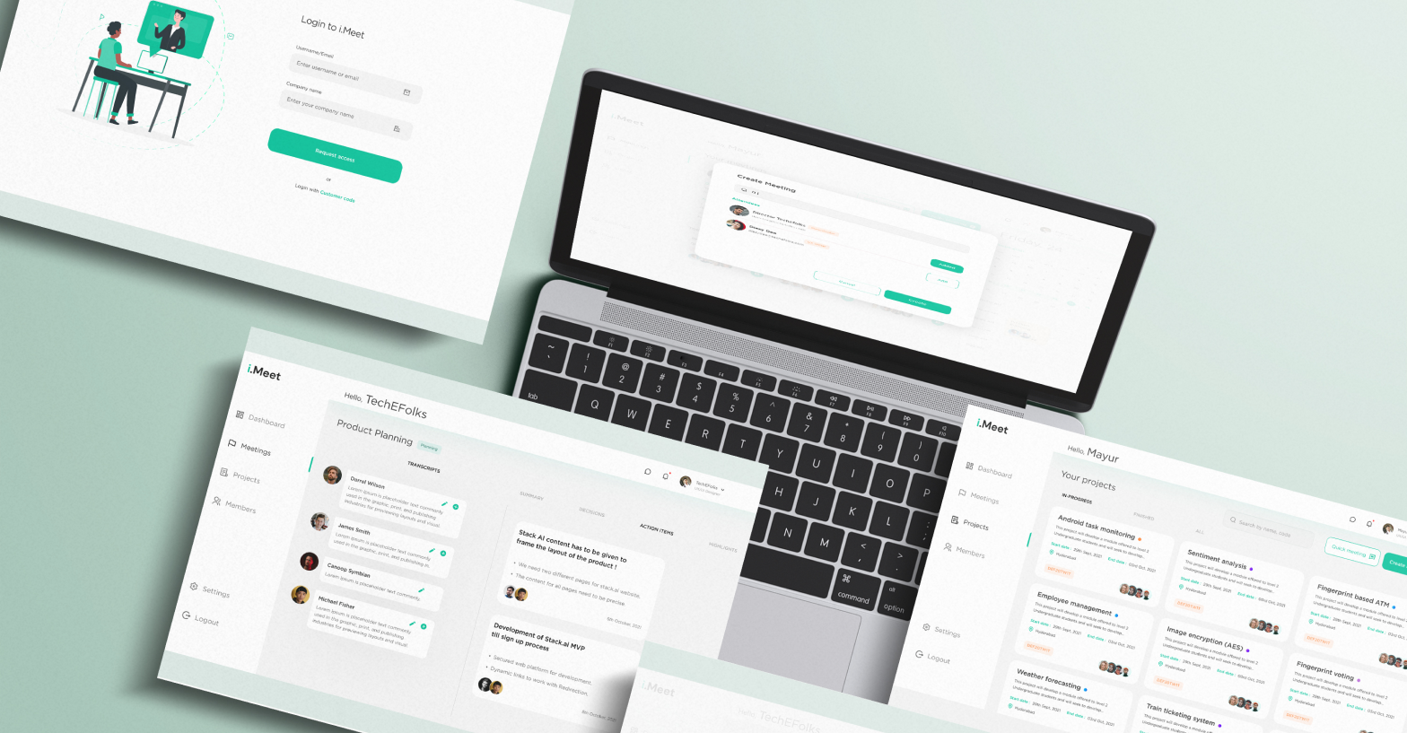
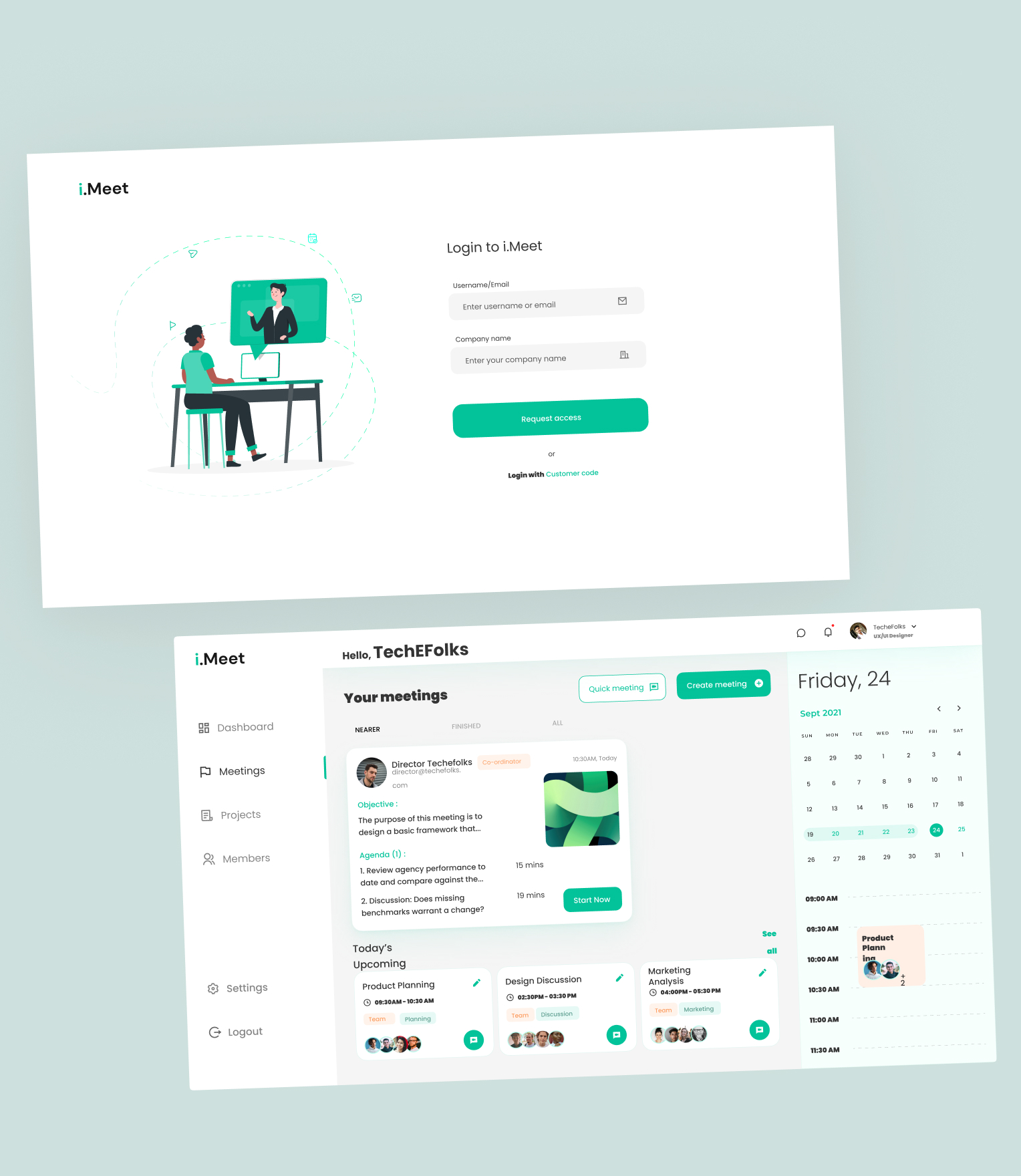
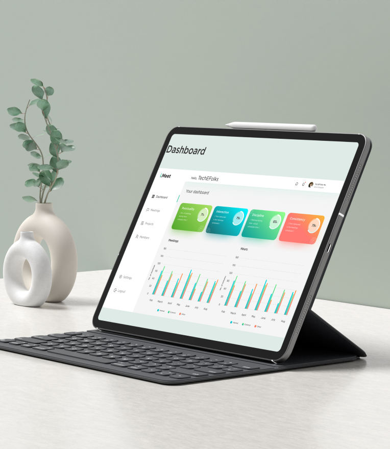
Our Solutions
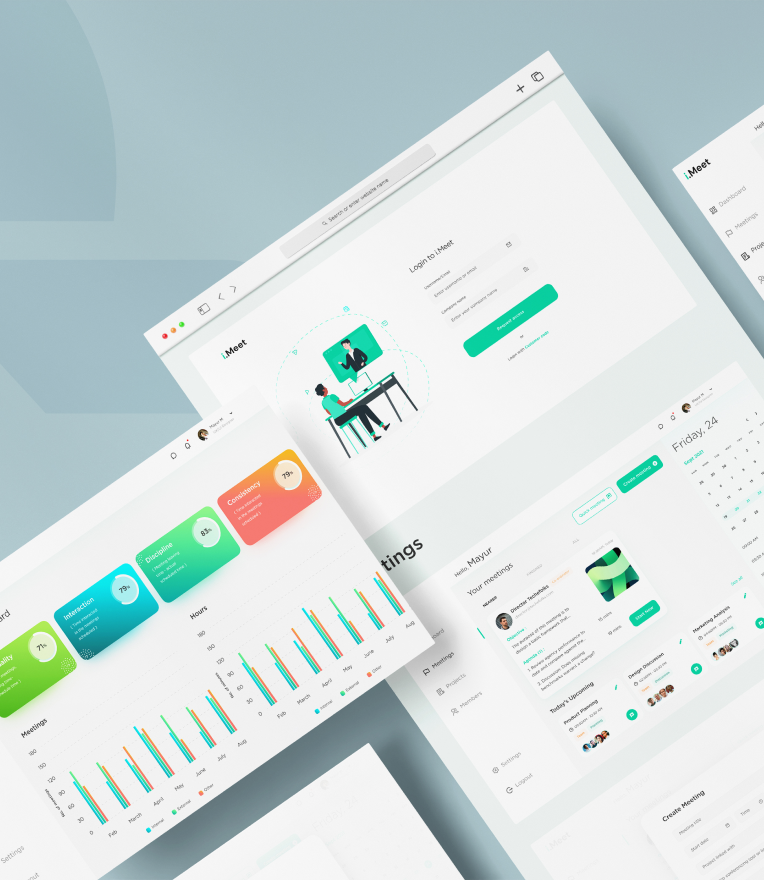
Session Meeting Notes Our intelligent conversation assistant summarizes the meeting and creates notes from voice actions in real time. This ensures that all of the participants understand the main points of discussion while providing a summary of what was discussed and any action items related to it.
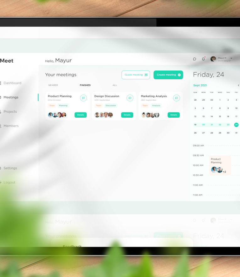
Powerful Integrations The app integrates with popular meeting platforms such as Google Meet and Microsoft Teams so you can manage your meetings from anywhere and free yourself from admin work as the meetings are reflected in IMeet along with their schedules.
Analytics/Insights It displays an employee’s punctuality by measuring his or her joining time. A person’s interaction time, which refers to how long they spoke and how many meetings they attended consistently.


Approach
As we moved forward, our product vision came into focus. We needed to create a tool that would meet the needs of our users and help them get the most out of their time in the workplace. We wanted to provide them with a way to manage their calendars and tasks, so they could get more done.
We uncovered this vision through conversations with our users, who told us what features they wanted from their calendars and task managers. We also looked at how other products were similar to ours and how they differed. We found some patterns: while many products focused on managing tasks, few offered a place for people to share files or track meetings. We realized that if we combined these two elements together, then we could create an intuitive tool that would make it easier not only for users but also for employers who had multiple users working on team projects together.
After developing an MVP that met these needs, we began testing it on different groups of users who used different types of calendars (e.g., personal vs. professional). When we asked them about their usage habits, they told us that they found the app very easy-to-use overall—it was intuitive and easy to navigate through your schedule.
Style Guide

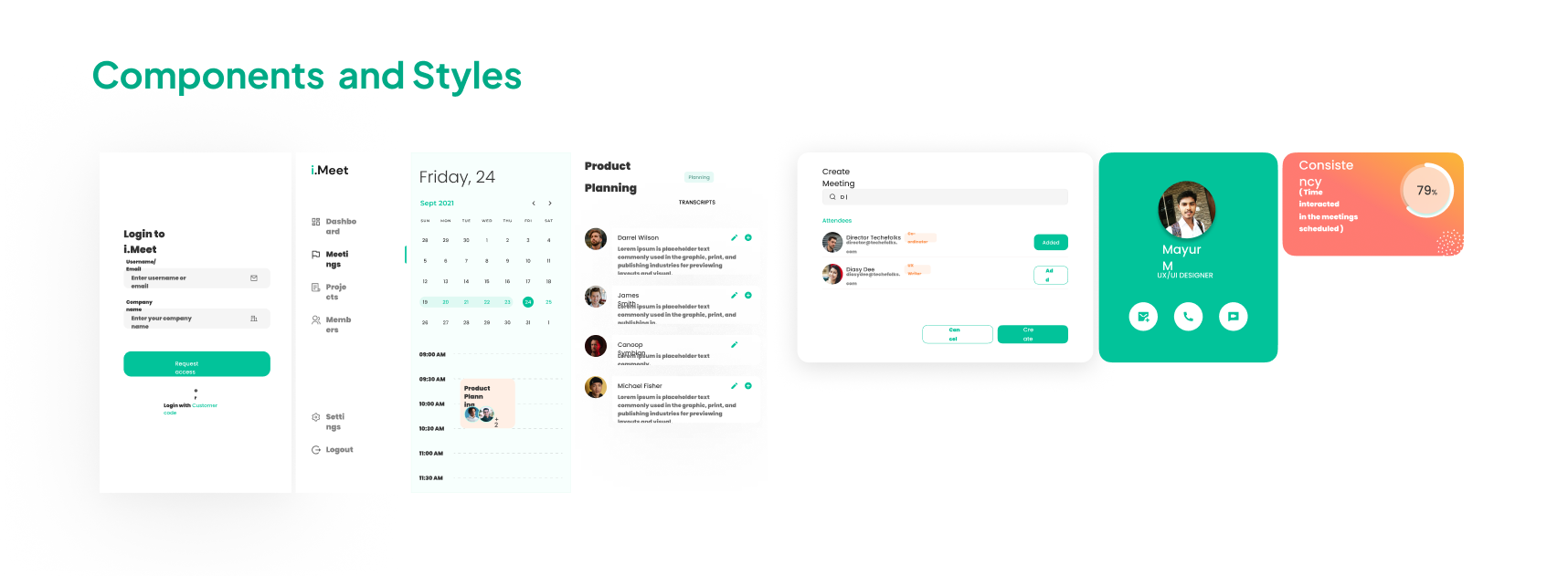
The Outcomes
Visual Output
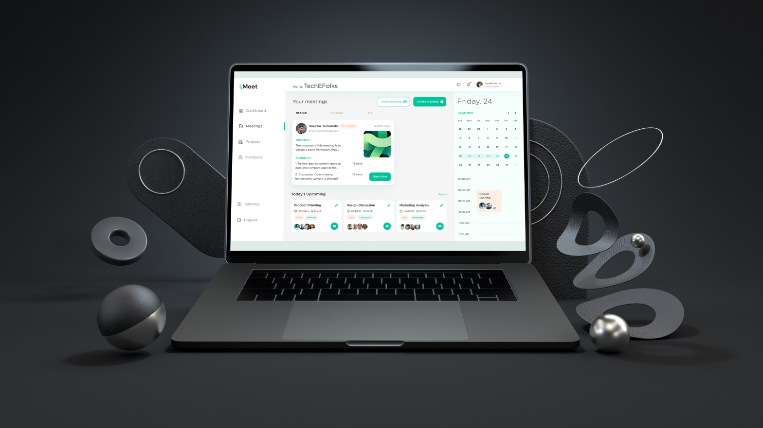
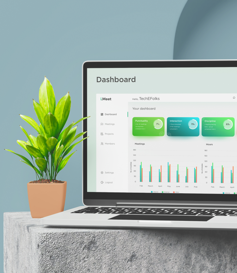
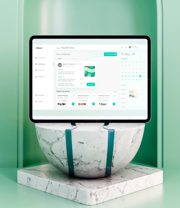
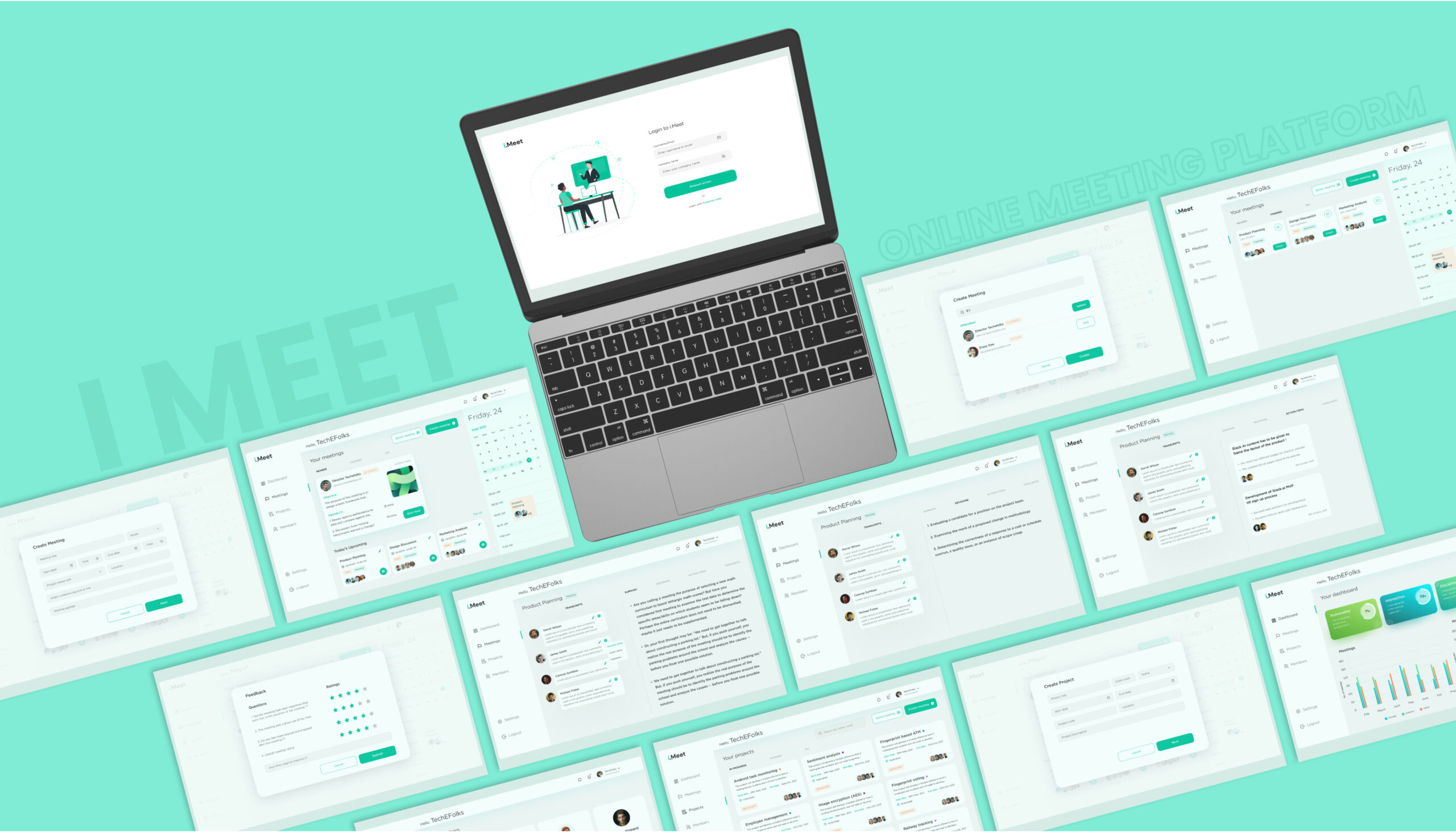
All Screen Design
Lets get started to build great
product with us


